28 Menopause Program
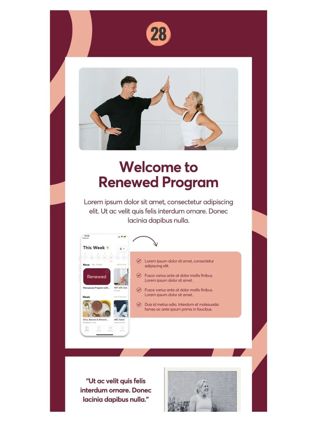
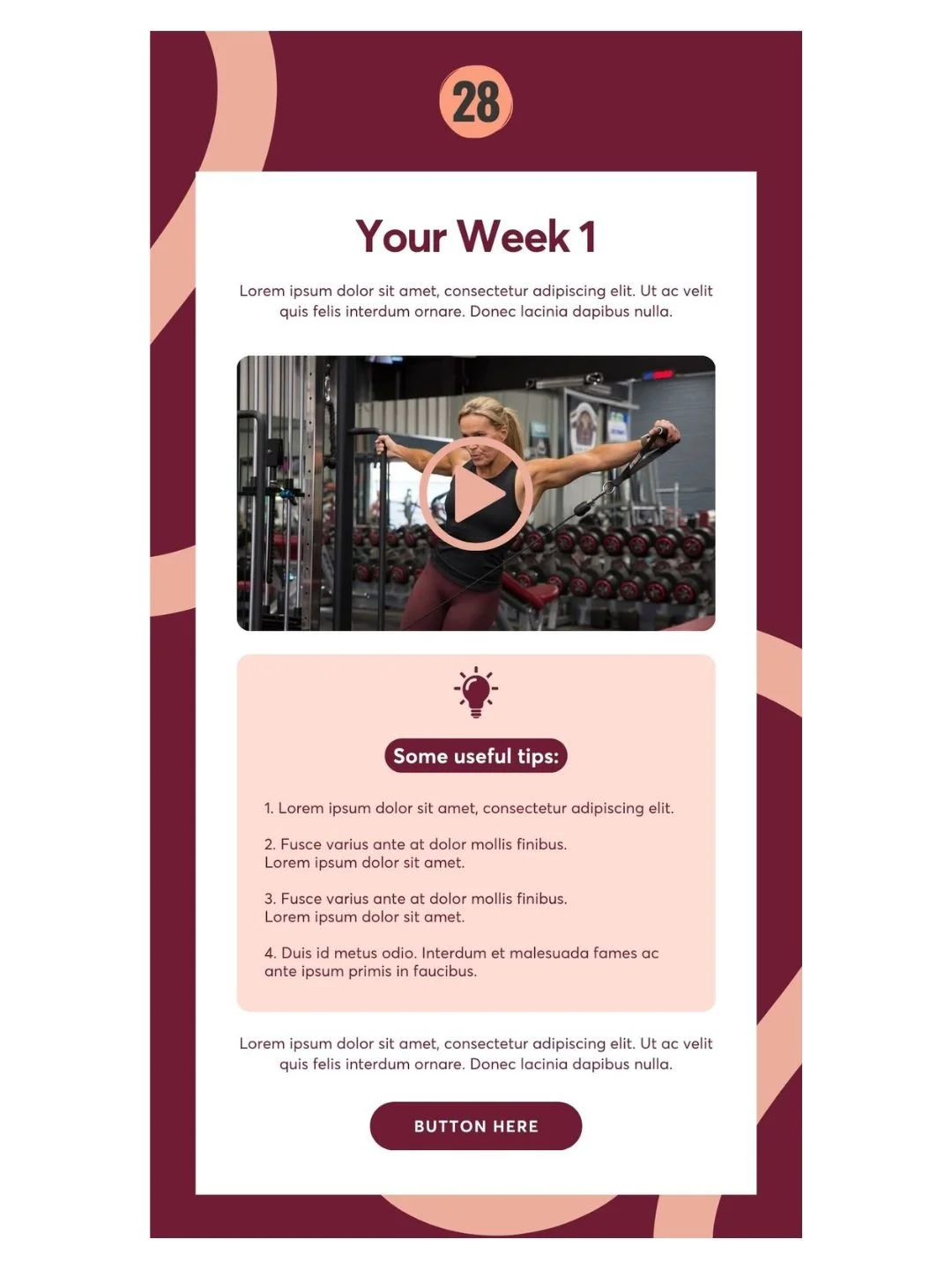
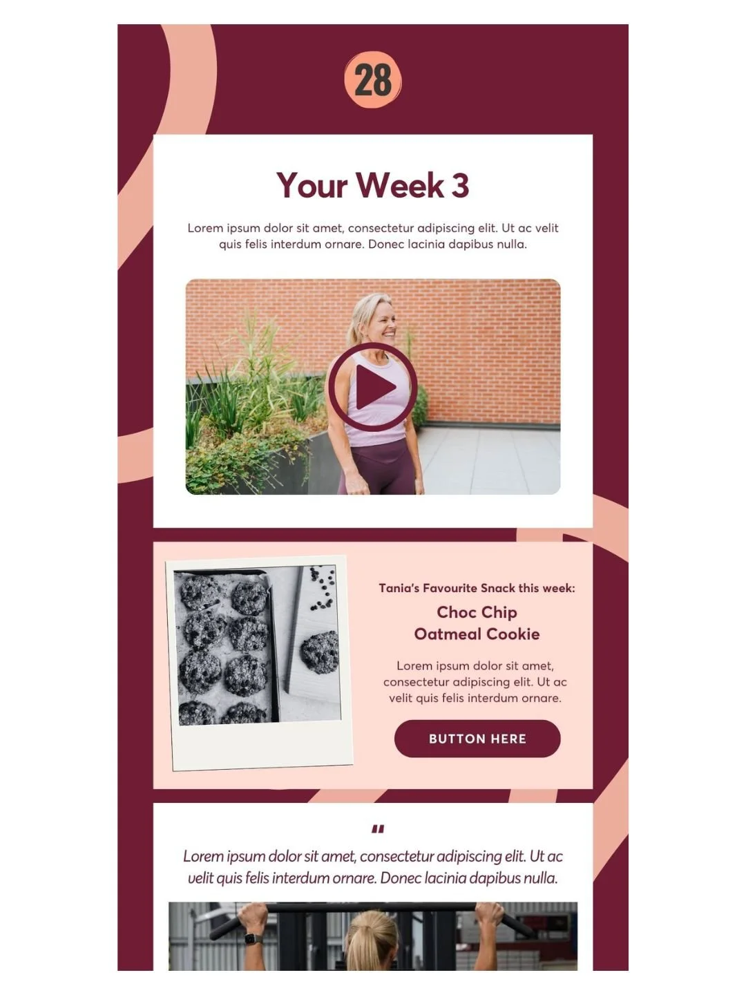
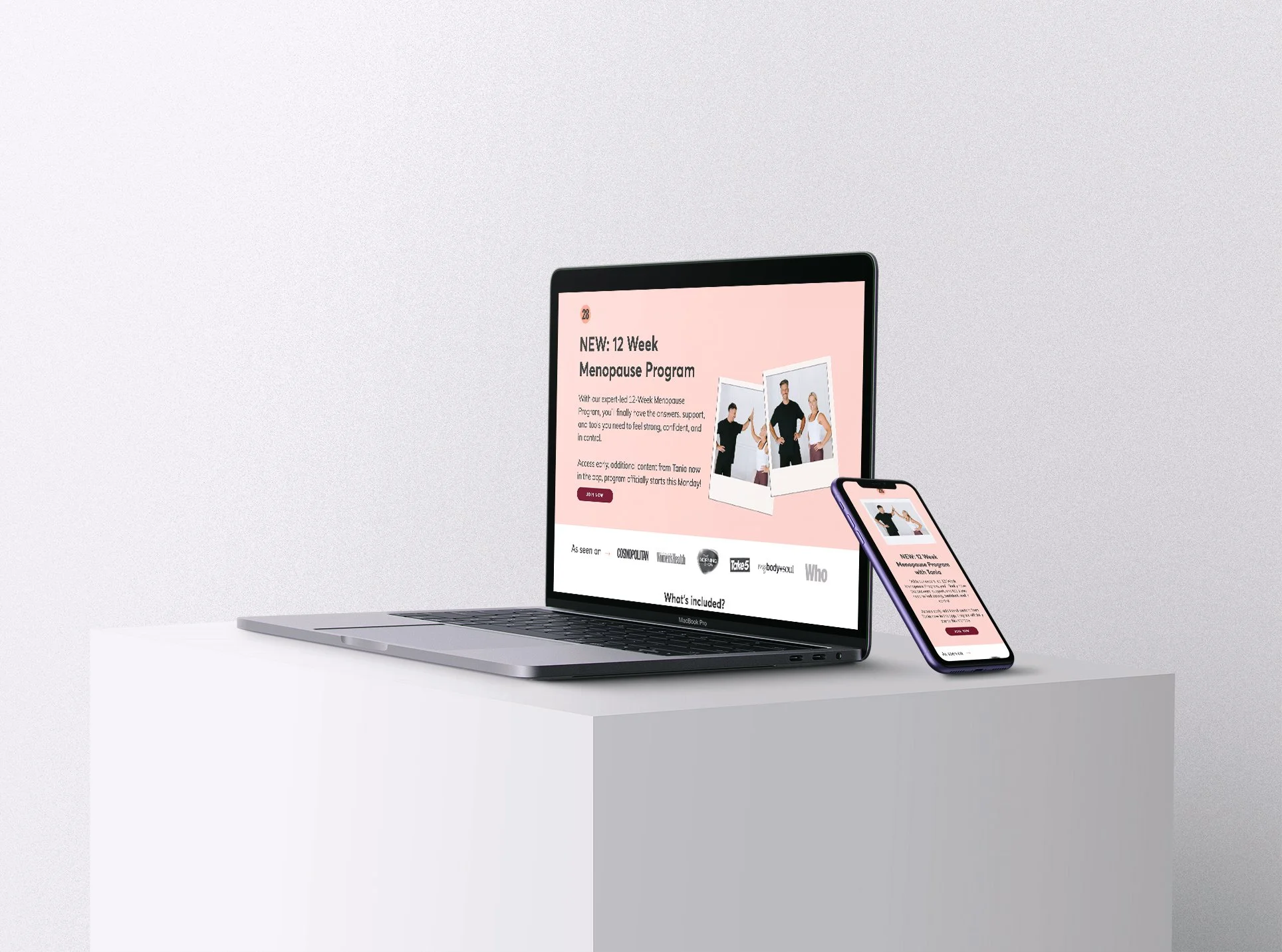
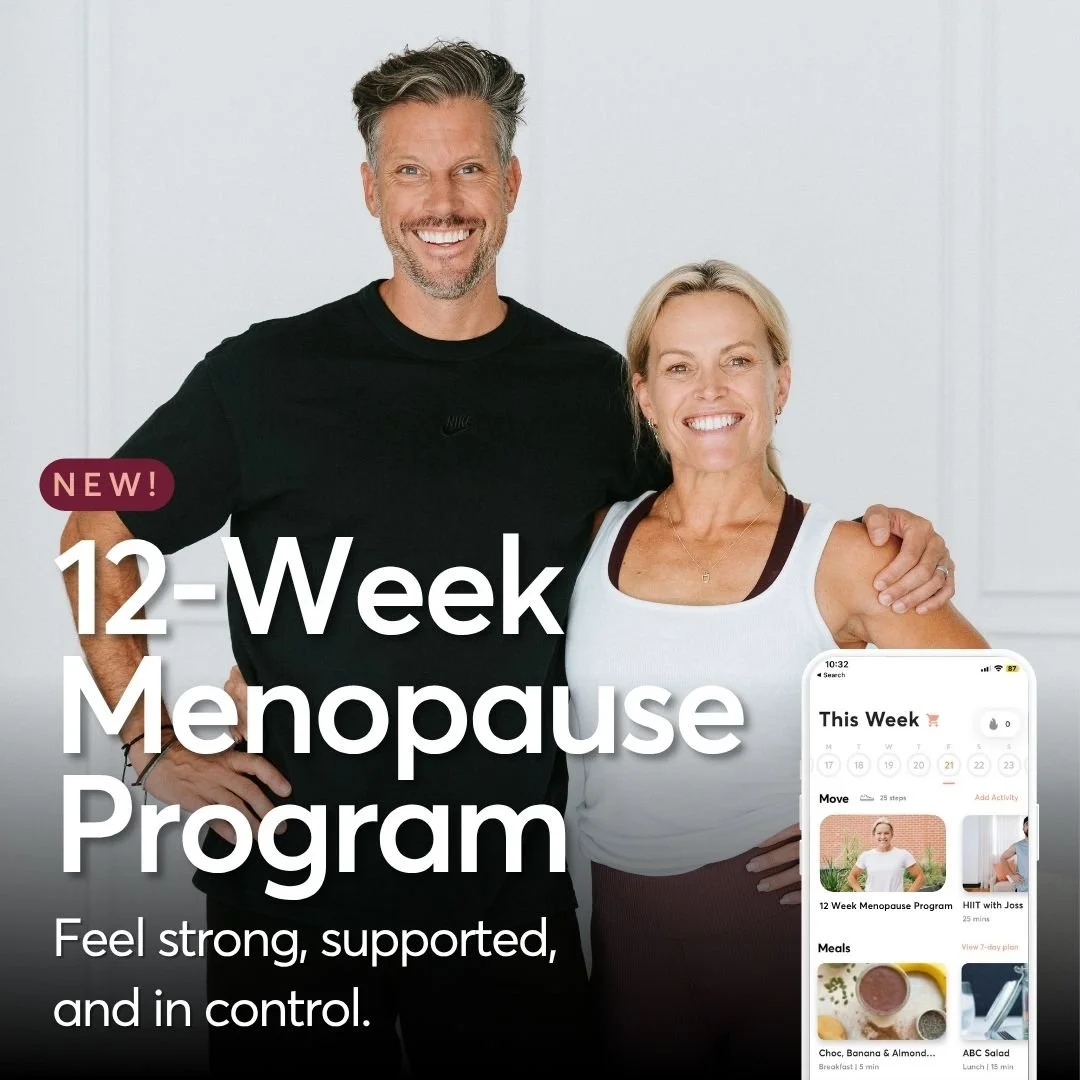
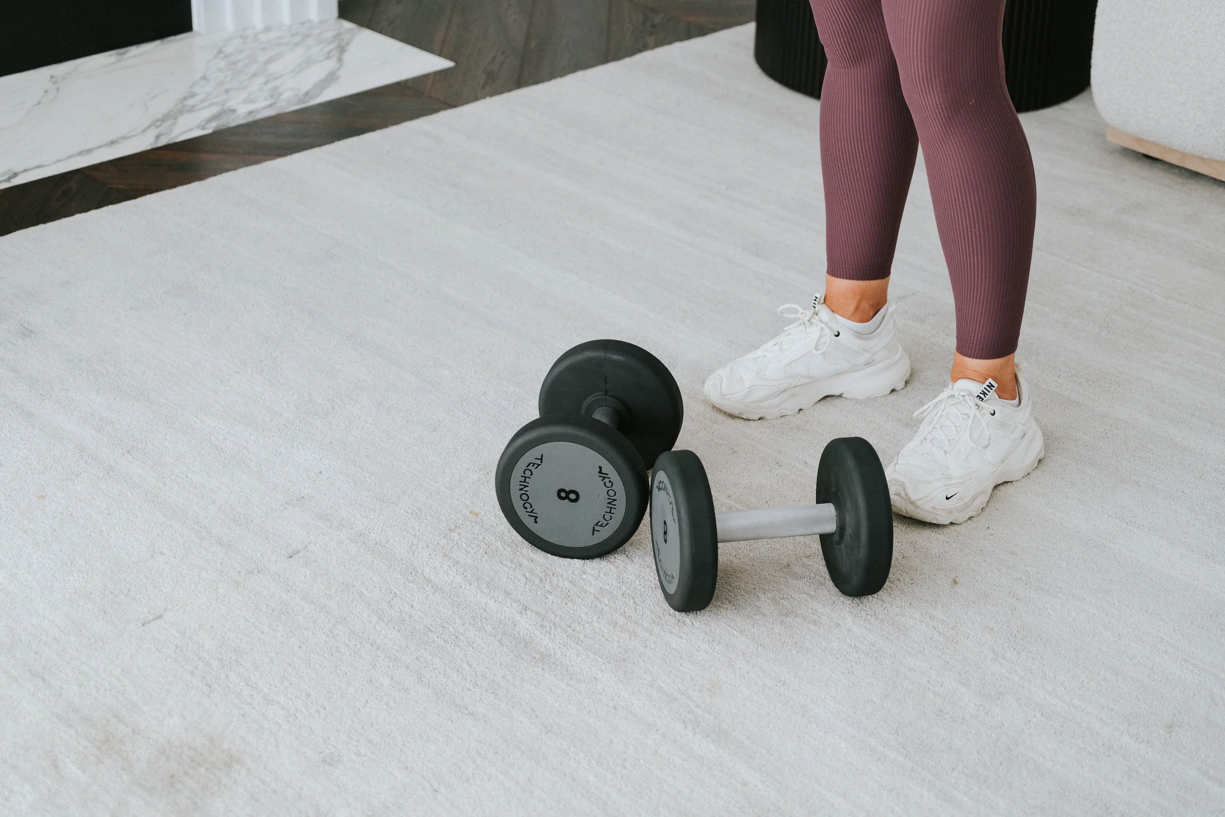
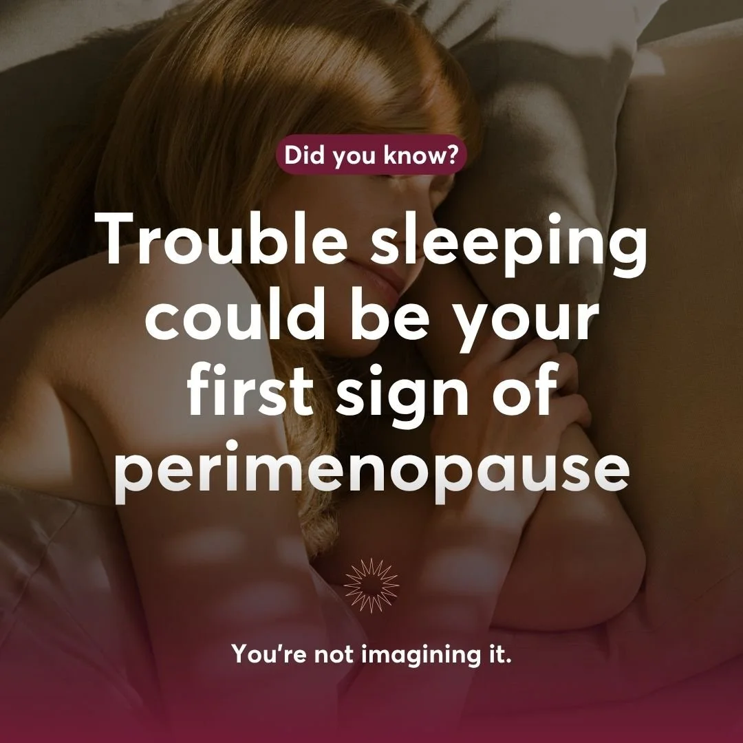
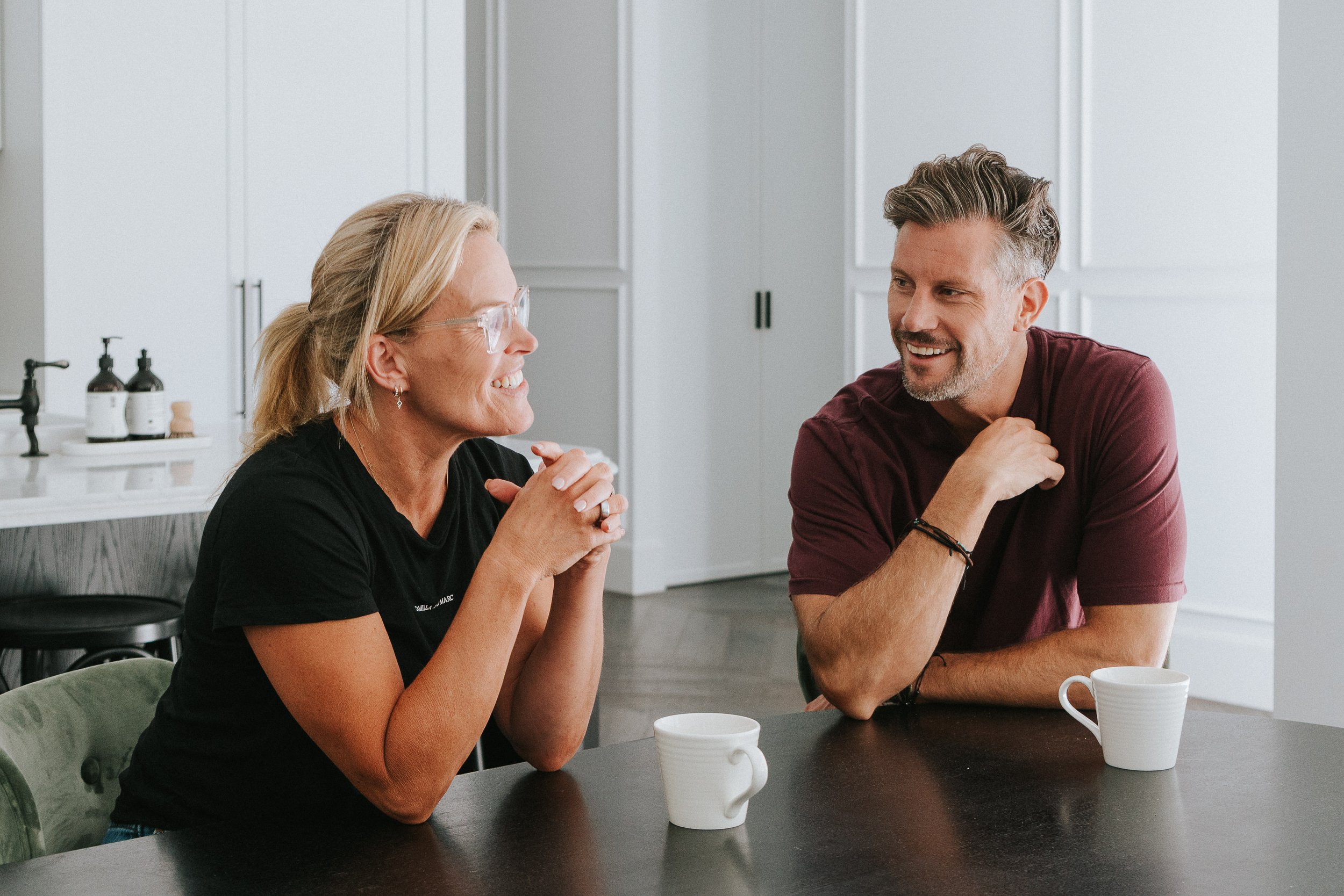
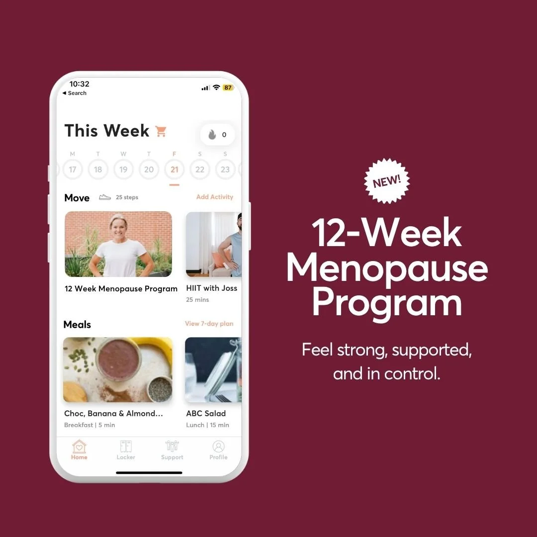
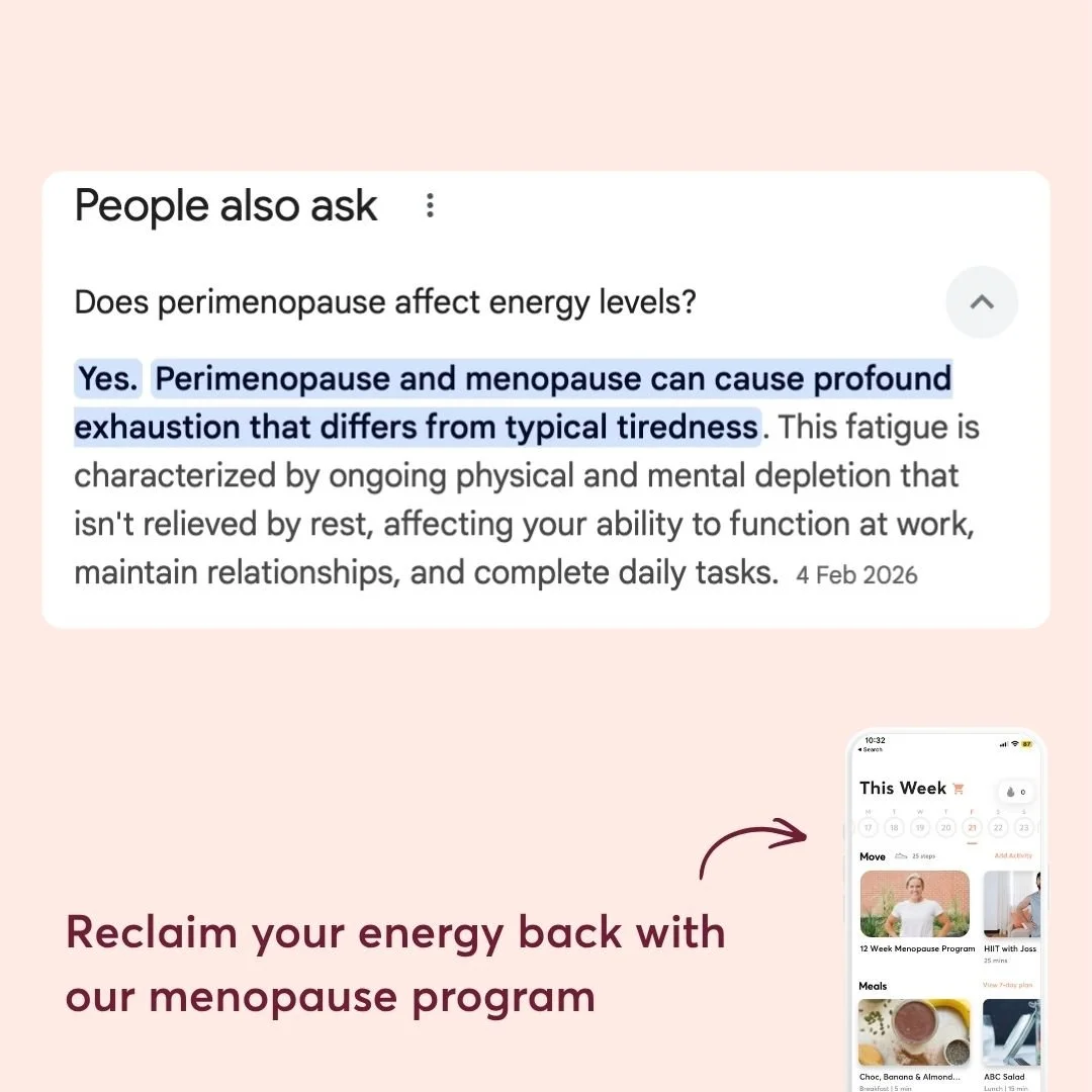
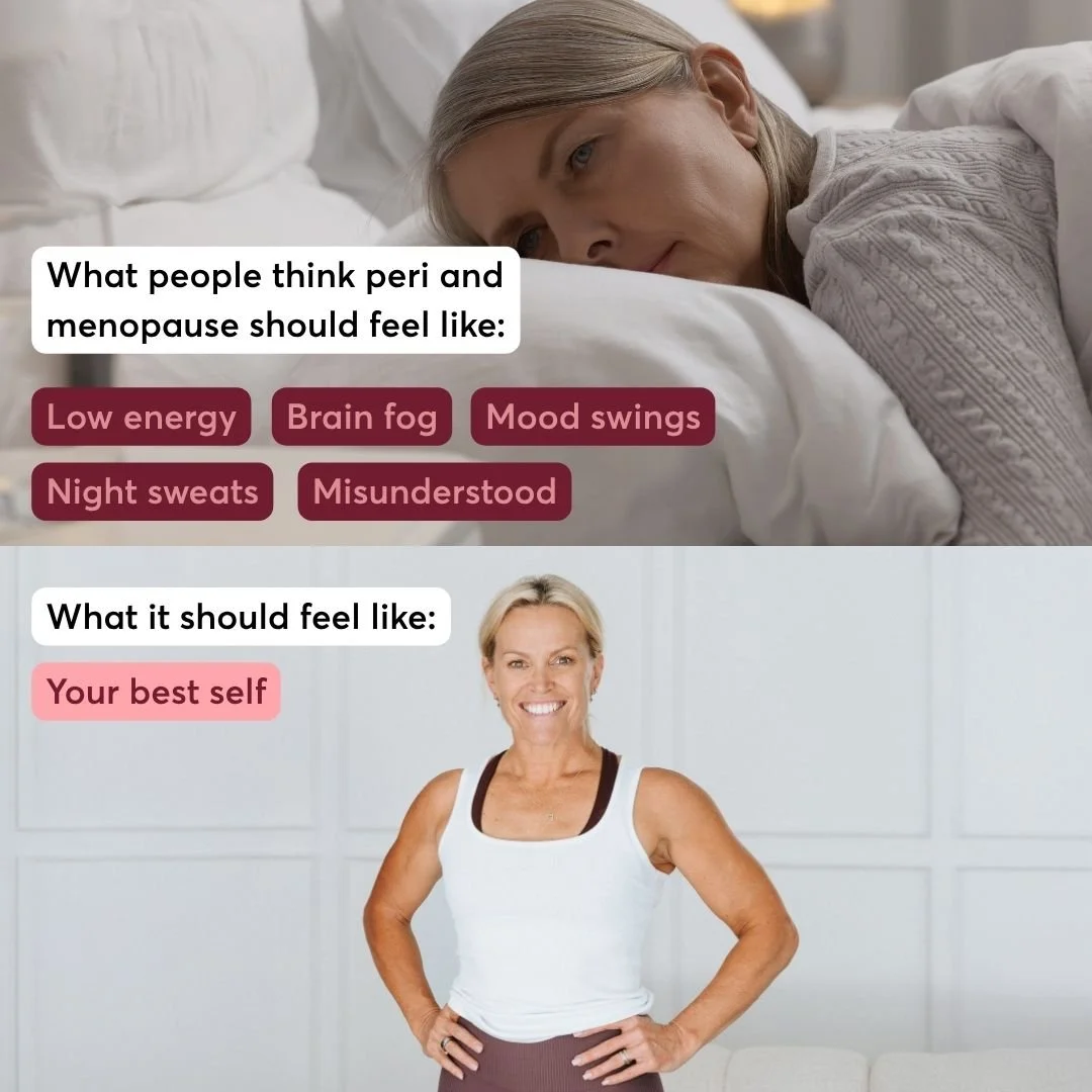
Menopause is a topic most fitness brands avoid or get wrong. For 28's Menopause Program I concepted the full visual identity — colour, tone, photography, ads, and CRM templates — to feel warm and real rather than clinical or patronising.
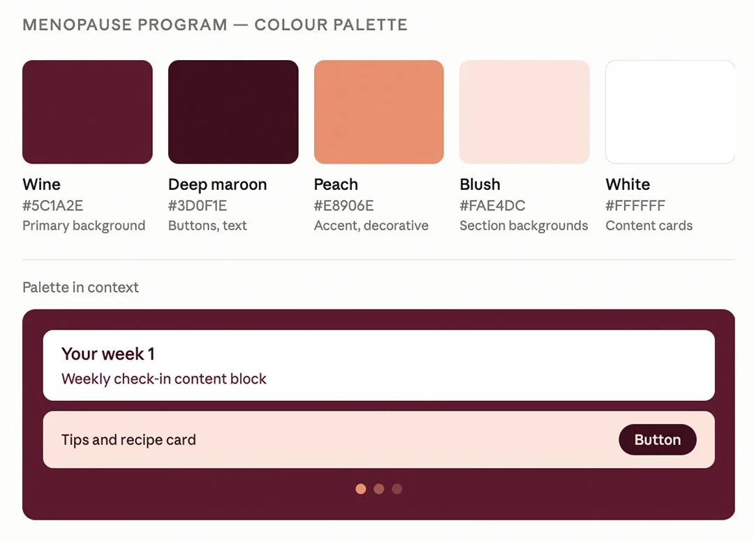
Colour Palette
The colour direction was intentional. Wine and blush feel warm and grounded rather than the clinical blues and greens most health brands default to. The palette stays connected to 28's primary coral while the deeper maroon signals maturity — a nod to the older demographic.




CRM Templates
EDM templates designed in Klaviyo for the full program journey — from welcome through to weekly check-ins.